The Challenge
STEM Generation sought to create a trustworthy brand design that resonates with teachers and parents, while engaging students in reading. The challenge was to create a friendly and inviting visual identity that captivates students' attention and enhances their learning experience. Bright and vibrant visuals were essential in engaging students' interest.
The Solution
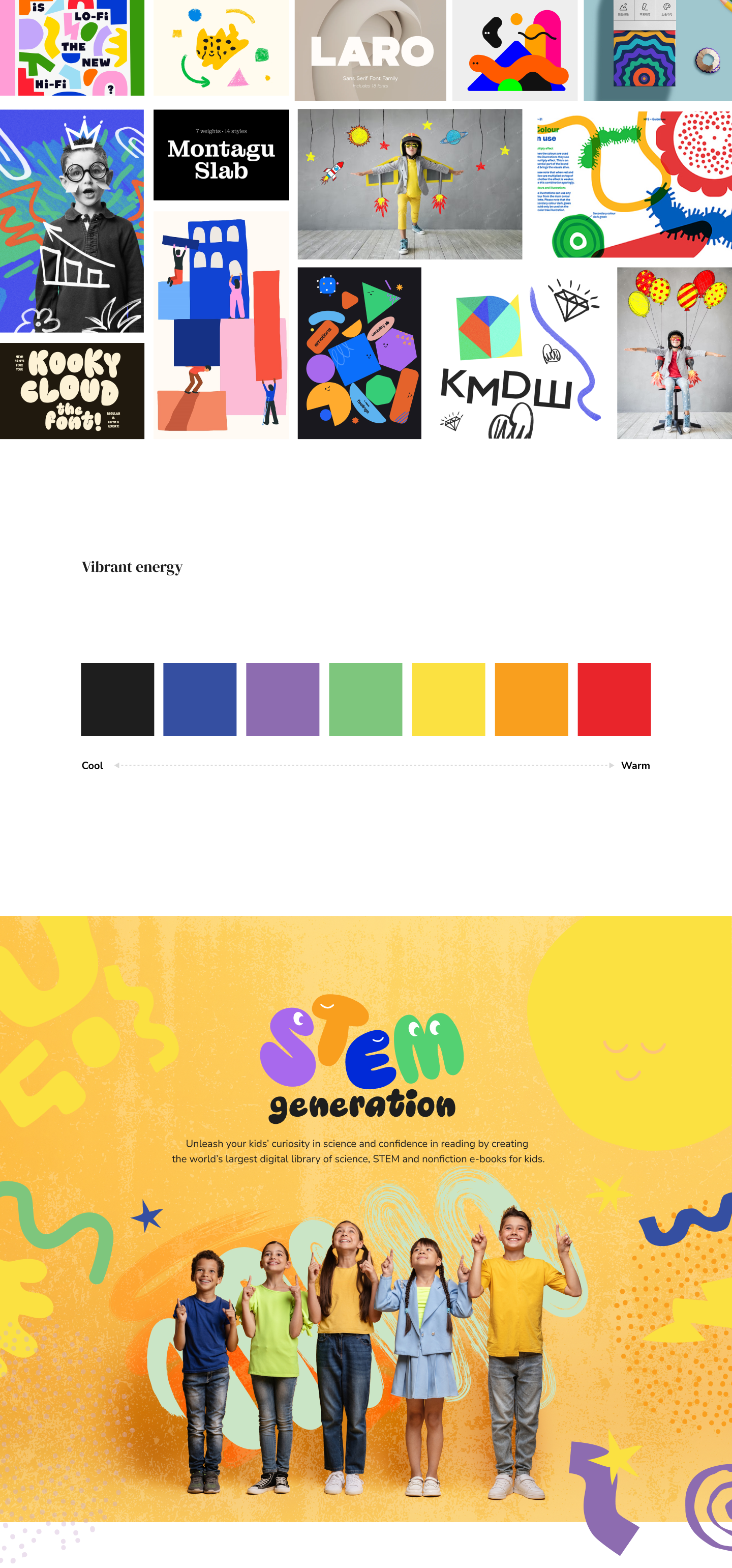
STEM Generation implemented a color-centric design strategy to enhance student learning by using warm colors such as red, orange, yellow, and violet. These colors are particularly effective in attracting and engaging younger students, aligning with their active and energetic nature. Elementary learners are especially drawn to yellows, reds, and oranges, which create a friendly, optimistic, and inviting atmosphere. Research, including a study conducted in 2014, supports the idea that warm colors can improve learning outcomes; specifically, reds and oranges have been shown to boost a child's IQ by capturing attention and helping anchor important facts and figures.
In addition to the color strategy, bold and clear typography was used to instill confidence and reassurance in parents and teachers. This design approach ensures the platform is visually appealing for students while remaining trustworthy for adults. By leveraging these design elements, STEM Generation successfully established a brand that fosters a positive and engaging learning environment for students, while also building confidence among teachers and parents.