The Challenge
The branding must reflect Flatiron's values, including diversity, rigor, and inspiring creativity. The team had a limited time to complete the re-launch, and the conflicting values made it difficult to communicate effectively within a single brand mark. A solution was devised by applying rigor and hard work values within the brand mark and the design language to "inspire creativity."
Refreshing the Brand
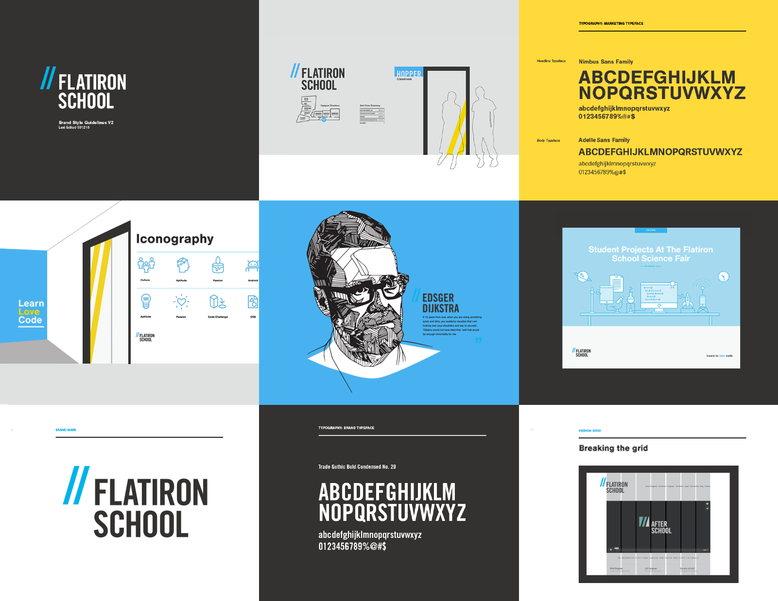
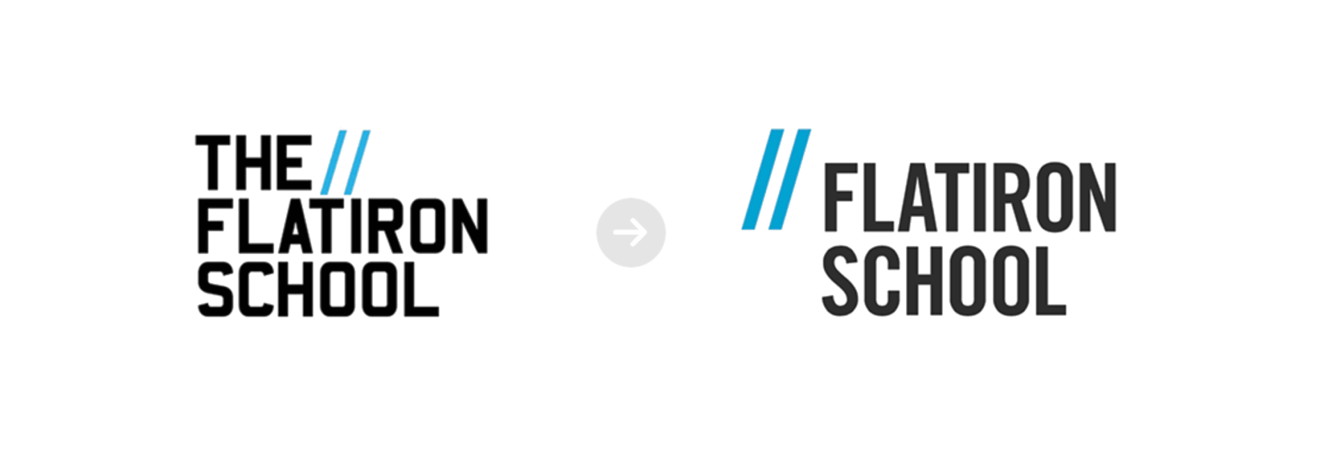
The "double slash" icon leads into the updated wordmark, extending beyond the word Flatiron. This visually breaks the design grid and emphasizes the rule-breaker metaphor in the brand's values. The slashes create a visual upward motion leaning on the wordmark that suggests 'Flatiron School will elevate you higher.' The reconfiguration of the slashes mimics the way developers write code. The team decided to simplify the brand by removing 'The' in the lockup.
My Role
In my role as Creative Director / Lead Designer, I collaborated with Flatiron's Leadership team, external branding agencies on brand design direction, marketing design, and Interior design architect firm MCDC.
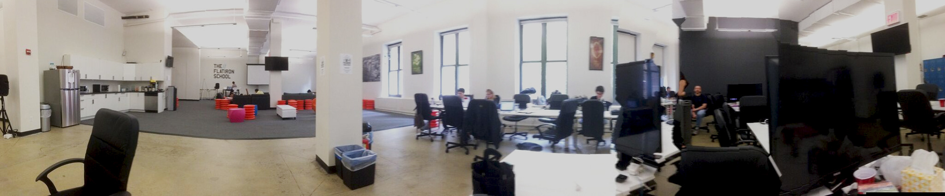
The Space Problem
The original campus was a large beige canvas with minimal furnishing and poorly utilized space. The challenge was to create permanent classrooms for Web and iOS Dev students with flexible meeting and common areas. The school hosts various events, meetups, student presentations, science fairs, and industry mixers; they need room to accommodate large groups, and set-up time requires a lot of manual work.
After speaking with staff and students, we identified the priorities in creating a fully utilized space.
1. Reduced preparation and clean-up time.
2. Flexible space and arrangement for socializing and collaborating.
3. Increase classroom, meeting rooms, and private phone booths.
4. It needed to be more fun and inspiring.
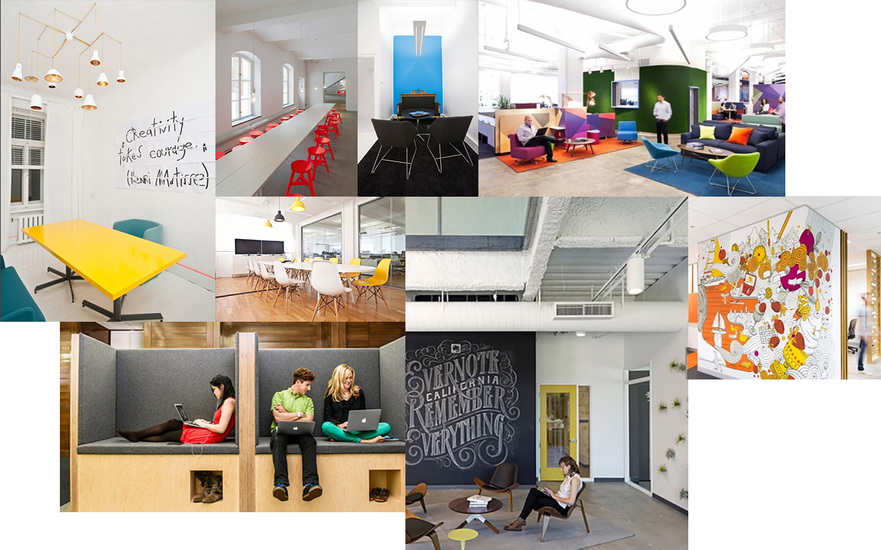
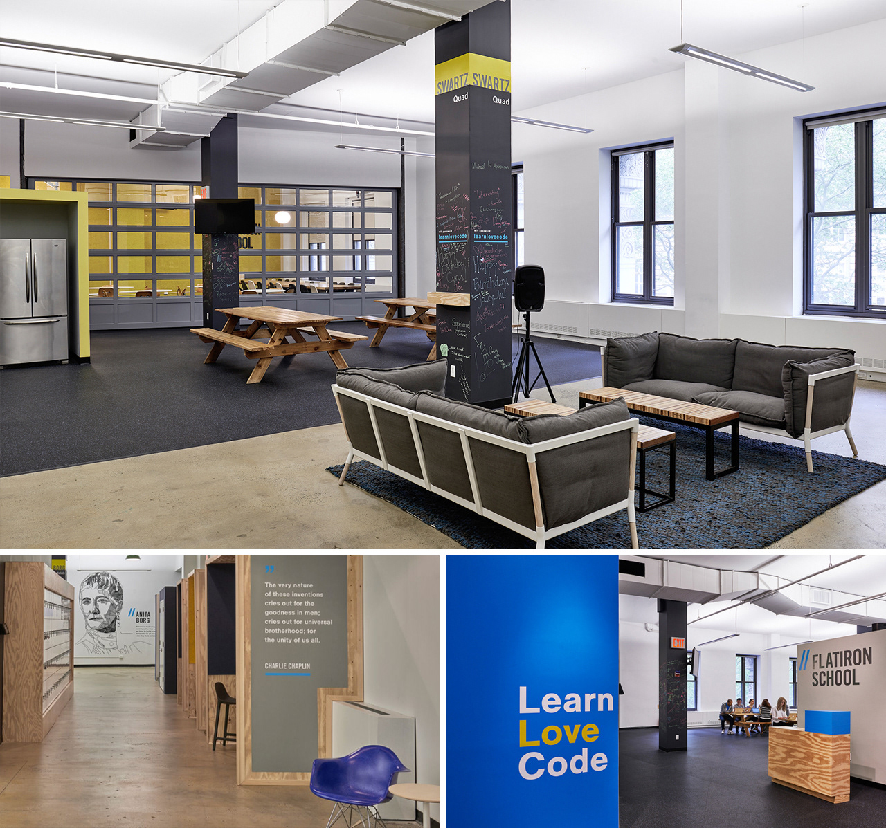
Interior Design Direction
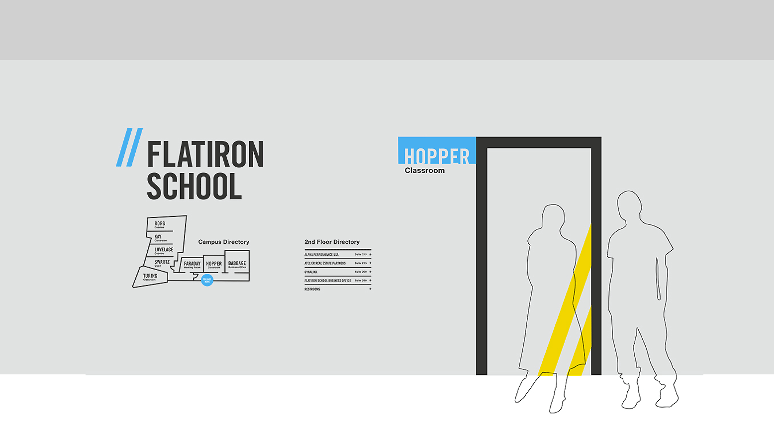
The design direction for the space focused on a friendly yet modern environment where collaboration can happen anywhere. Splashes of brand colors add vibrancy to the crisp design, with graphic decals highlighting critical figures in computer science history and introducing the past, present, and future.
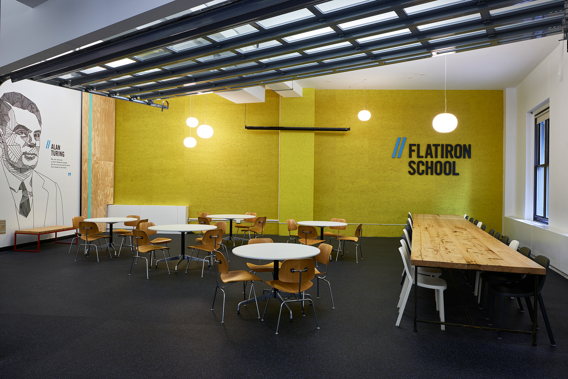
The Solution
Before the redesign, the campus space was not fully utilized and required manual labor hours to prepare for any event. With this in mind, the Flatiron team worked with the architects to solve this problem by mixing different sizes and shapes of tables with multiple configurations that looked messy. The newly defined campus layout offered numerous areas for creating flexible, collaborative workspaces for staff and students.
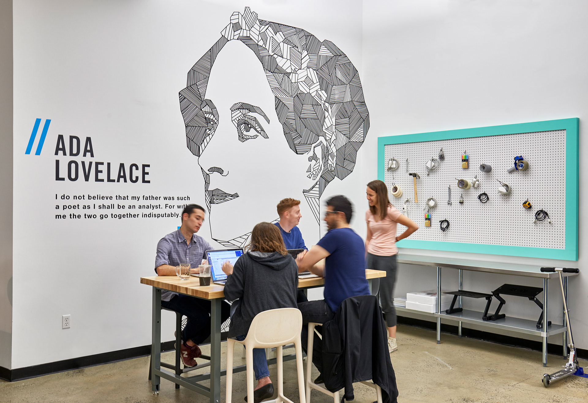
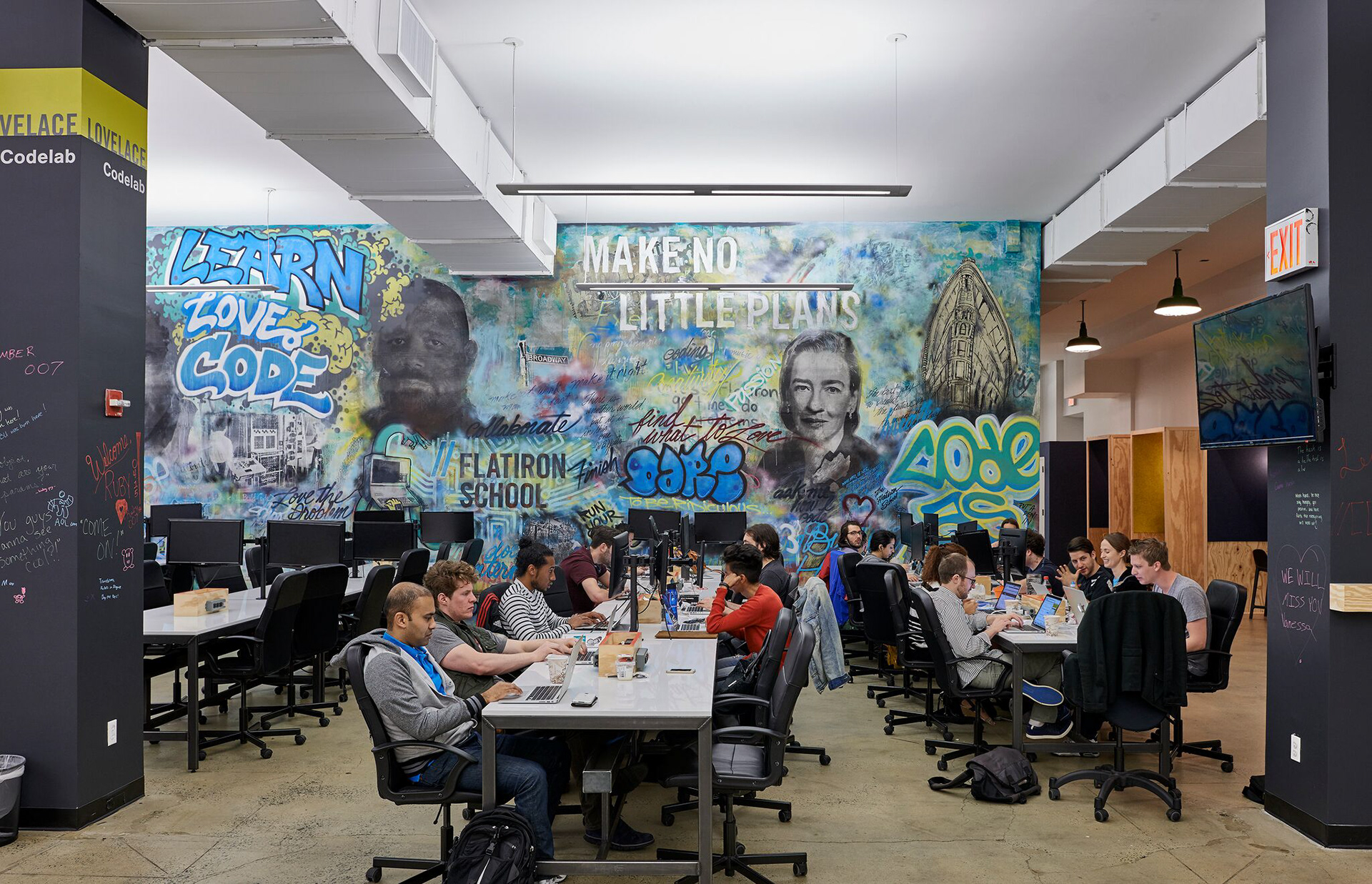
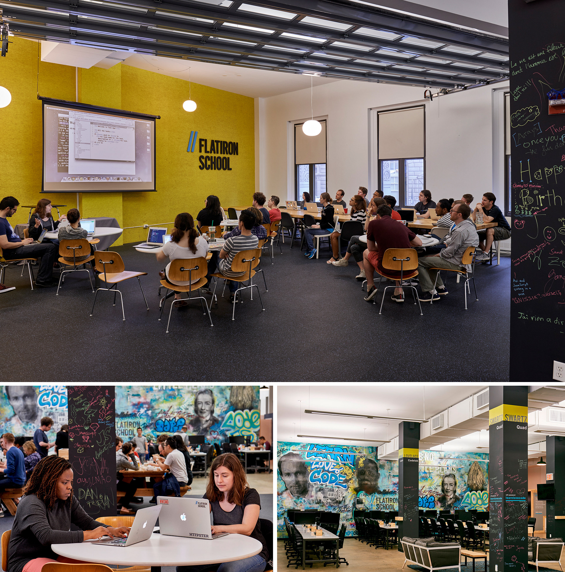
The past, present, and future
The finished design has a contemporary feel and friendly ambiance delivered through simple materials and striking graphic installations. The revamped campus's centerpiece is a collaborative graffiti wall created by students, staff, and NYC street artists. The mural reflects the brand's ethos and ideals and inspires past, present, and future students of coding power. The outcome represents diversity and collaboration.